My new Gallery Walls from JUNIQE
Advertisement / This article was created in collaboration with JUNIQE.
Ah,
I'm really excited right now! I can finally tell you about a project that's been in the pipeline for some time and that has probably brought about the biggest change to my apartment. What am I talking about? My two gallery walls with prints from JUNIQE , which recently moved into my living room and dining room. I can't tell you how happy I am with them! I would never have thought that it was possible to give an apartment a completely different look using just prints. Recently I only had a few posters on the walls and I was actually quite fine with them. I can only laugh about it now because I can't imagine the two rooms without the prints. But I don't want to keep you in suspense any longer; I want to finally show you the end results. Tadaaaaaa!
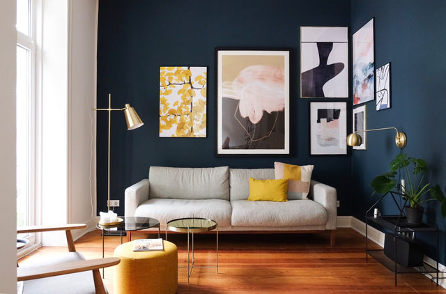
Living room
For my living room, I had planned to be a bit more daring with the individual prints and to step out of my comfort zone. But I never thought that the result would blow me away so much! I don't think I need to say much about it other than that it is true love! When the individual prints were delivered, I had to swallow hard. Wow! The largest picture felt almost as big as me. I was a bit panicked that I would suddenly cover up far too much of my beloved blue wall. Completely unfounded, as it turned out, once the pictures were hanging.


1. Tan Kadam “Flora” – Ginko // 2. Iris Lehnhardt “Untitled 160318” // 3. Peytil “Blues” // 4. Jilli Darling Art “Sunday in the Cell” // 5. Iris Lehnhardt “Abstract Painting III” // 6. Astër “Sagittarius Blue” // 7. Peytil “Pop Body”
dining room
Since the room is dominated by white and wood, I wanted to be a little calmer with the pictures here than in the living room. Recently I've always complained that the room lacked a certain coziness. By using the entire ceiling height, that's exactly what has changed and the room now radiates a warmth that wasn't there before.


1. Studio Nahili “Smooth Movement” // 2. Niina Pechkovskaya “Stains” // 3. The Home Office Studio “Iva 06” // 4. Mandy Rep “Striber” // 5. Paul Aidan Perry “Earth” // 6. Rosi Feist Alphabet “Neon Red And Black” // 7. Fox & Velvet “City Sunset”
But how do you actually put together a gallery wall? And how do you know which size to choose for which picture? Questions upon questions that I also asked myself. I was all the more pleased when Junqie invited me to her office in Berlin and I was given the opportunity to work with the senior art curator Martin Kranz to design my two gallery walls. You can probably imagine that I couldn't wait for the meeting. And luckily the time flew by and I was already sitting in the Juniqe office looking at different prints and artists with Martin. It was so incredibly exciting to see how he had something to say about each artist and I immediately had the feeling that the gallery walls would be phenomenal. I seized the opportunity and asked Martin a few questions. There must be some tips and tricks about what to look out for when you decide on a gallery wall.

How do I find the perfect mix of motifs, sizes and colors? What questions should I ask myself when making my selection?
- Art is of course not a commodity like a hand blender or a doormat. Art should (must) trigger emotions and feelings, awaken memories, create a certain mood, move something in the viewer. Only if you like a picture one hundred percent yourself does it have the potential to fit into your home. In the long term, you will get little joy from a work of art that only serves as decoration and makes a neutral impression on you. Buying art should always be a subjective decision and never be made based solely on the place where a picture is hung.
How do I determine the correct height / hanging tip?
- As is often the case, the right answer is obvious - or rather, it's in your eyes. As a rule of thumb, I would always aim for eye level first, for the simple reason that you can see the picture best then. Basically, it's a good idea to place the top third of the picture, or the main picture of a gallery wall, at about your own eye level.

Styling tip: Create contrasts
- I am a big fan of strong, exciting contrasts – you can create interesting visual worlds and even real conversation starters even in the smallest of spaces if you just dare to make small, controlled breaks in style.
- It becomes particularly interesting when you find the courage to combine different art styles, aesthetics, color schemes or even price categories: well-known and unknown artists, modern designs with pictures from the flea market, black and white illustrations with pop art motifs - the tensions or harmonies created in this way give a room/wall its own dynamic, can raise questions, tell stories, stimulate thought or simply surprise. Dare to mix styles!
- It is important not to overdo it - in my example, two completely different styles (landscape photography and pop art-inspired stencil graphics) are combined in two completely opposite colors. The trick here is that we have placed two individual complementary colors next to each other, although they only consist of one color each (rich, dark blue vs. bright pink). The result is a strong contrast, but nothing that would appear restless, inconsistent or even chaotic.

Acrylic, Dibond, canvas or poster – are there materials that are better suited to a particular motif and art style and can you mix them together?
- When choosing the perfect medium, it's not just a matter of taste and the room's decor, but also the color of the walls. Pictures look even better against dark walls, for example, if they have a large white passe-partout. In Nordic, functionally furnished rooms, I would certainly go for a black-framed print rather than a canvas. The overall concept has to be right; you never really see a group of pictures in isolation on a wall, but always in the context of an overall interior.
- Particularly beautiful: photographs on acrylic glass, on which images appear particularly colorful and brilliant, although for black and white graphics or drawings I would primarily choose a framed art print.
- I would prefer to see softer illustrations and especially watercolors/paintings on canvas – I personally don't like photography or black and white typography as much.
Basically, it always makes sense to stay as close as possible to the 'traditional' typical medium for a particular technique - e.g. canvas for oil paint or watercolors.
What do I need to consider to properly showcase my favorite subjects?
- I always find it helpful to lay the pictures out on the floor and simulate the hanging, also because it allows you to look at the hanging from a distance and take in the effect. It also helps to recreate the arrangement on the wall using crepe tape and wrapping paper - this gives you a very precise idea of the end result, helps with the exact placement of drill holes and the like, and leaves most walls undamaged - which is sometimes problematic even with pencil.

Now that's what I call helpful tips! Oh, and you know what else I think is great: on JUNIQE.de you have the option of having the pictures framed directly. You can see the respective picture in the different frames, making it easier to imagine the different options. Good stuff! And you can even get free advice. Well, if that's not something!
I definitely took one thing away from this collaboration: be braver! To be honest, I don't know if I would have dared to use some of the large pictures myself. Probably not! But it is precisely the large pictures that give both gallery walls a distinctive look! I am incredibly grateful to Martin for the tips and the result and will take them more to heart in the future.
